
Color plays a crucial role in design, influencing emotions, perceptions, and brand recognition. Whether you're designing a website, a logo, packaging, or event branding, selecting the right color palette is essential for creating a lasting impact.
Why Color Matters in Design
Colors are more than just visual elements; they evoke emotions and shape consumer behavior. Studies show that up to 90% of snap judgments about products are based on color alone. A well-thought-out color palette can enhance brand identity, improve readability, and create a memorable experience for users.
Understanding Color Psychology
Different colors convey different emotions and associations. Here’s a breakdown of some key colors and their psychological impact:
- Red Passion, excitement, urgency (often used in sales and food industries)
- Blue Trust, calmness, professionalism (commonly used by financial and tech brands)
- Green Nature, health, freshness (ideal for eco-friendly and organic brands)
- Yellow Optimism, energy, happiness (used for attention-grabbing designs)
- Purple Luxury, creativity, wisdom (associated with premium or artistic brands)
- Black Sophistication, elegance, power (great for high-end brands)
- White Simplicity, purity, minimalism (used in modern and clean designs)
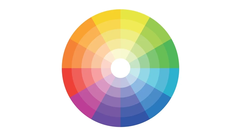
Types of Color Palettes
There are various ways to create a balanced color palette. Here are four fundamental types:
- Monochromatic Uses different shades, tones, and tints of a single color for a cohesive and elegant look.
- Analogous Combines colors that are next to each other on the color wheel, creating a harmonious and natural feel.
- Complementary Uses colors opposite each other on the color wheel for strong contrast and visual impact.
- Triadic Uses three evenly spaced colors on the color wheel to create a vibrant and balanced design.
How to Choose the Right Color Palette for Your Brand
There are various ways to create a balanced color palette. Here are four fundamental types:
- Define Your Brand Personality Think about the emotions and values you want your brand to convey.
- Consider Your Target Audience Different demographics respond to colors in unique ways.
- Analyze Competitor Colors Identify industry trends but aim for uniqueness.
- Test for Accessibility Ensure readability and usability for all audiences, including those with color blindness.
- Stick to a Few Core Colors A good palette typically includes 3-5 main colors to maintain consistency.
A well-crafted color palette enhances your brand’s visual identity, strengthens customer perception, and ensures consistency across all platforms. By understanding color psychology, selecting the right combinations, and maintaining brand consistency, you can create designs that not only look beautiful but also resonate with your audience.
What are your go-to colors for branding and design